
Contact form popup template
A simple form to let users send you messages.
The contact form popup template is a small form that any visitor can fill out and submit to send you a message.

The contact form lets you collect messages from your visitors
Collected data
This popup collects the visitor's E-mail address and message.
Whenever the form is submitted, an Event is sent to WonderPush. This event is called Contact and it contains two attributes named string_email with the visitor's email address and string_message with the visitor's message.
You can adapt the name of the event and its attributes by changing this line:
window.WonderPushPopupSDK.trackEvent('Contact', {string_email: email, string_message: message});You can view and download the collected data on the detail page of your popup:

A list of the messages collected, along with the download button
Audience
By default, the audience is set to Everybody.

But you can limit the audience to users who haven't sent a message yet.
You can further restrict the audience by adding more criteria by clicking "Add criteria". There is a complete reference of the data you can use to segment your audience, there is also a guide to get started with audience segmentation
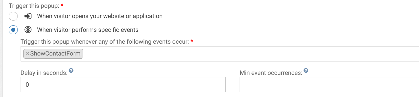
Trigger
By default, the popup immediately after an ShowContactForm event. To trigger the event, put a link or a button on your page with the following onclick script:
<button type="button" onclick="(window.WonderPush = window.WonderPush || []).push(['trackEvent', 'ShowContactForm']);">Contact Us</button>You can adapt the name of the event in the popup editor:
Adapting the content
This popup is made with HTML. While knowing a little HTML helps, we'll try to take you through the most common changes.
The Contact form template contains:
- a title, "Contact Us"
- an email field
- a message field
- a button, "Send message"
- a thank you message "Thank you, we will contact you soon.", displayed after clicking the button
Adapt the title by changing this line:
<h1>Contact us</h1>Adapt the button text by changing this line:
<button class="btn-primary" type="submit" data-wonderpush-button-label="Subscribe">Send message</button>Adapt the thank you message by changing this line:
<h1>Thanks, we'll be in touch with you soon.</h1>Look and feel
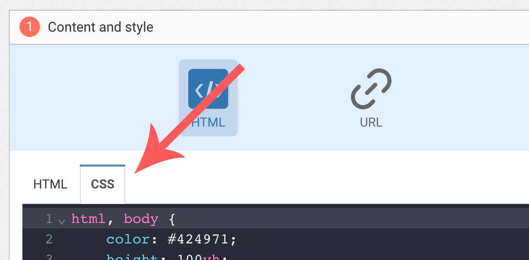
Colors and fonts of texts and buttons can be adapted in the CSS editor:
Adding a background image
Add the following CSS (adapt https://example.com/image.png) to add a background to the main section, making sure the background is stretched to cover the entire section (but keeping its aspect-ratio):
#content {
  background-image: url(https://example.com/image.png) !important;
  background-repeat: no-repeat;
  background-size: cover;
}
Button colors
Add the following CSS.
.btn-primary {
  background-color: blue !important; /* Adapt "blue" to the desired color */
}
Text color
To adapt the colors of the title, input, button and dismiss button, adapt the following.
/* Use the following for the main button */
.btn-primary {
  color: red !important; /* Adapt "red" to the desired color */
}

/* Use the following for the dismiss button */
.btn-text {
  color: red !important; /* Adapt "red" to the desired color */
}

/* Use the following for the title */
h1 {
  color: red !important; /* Adapt "red" to the desired color */
}

/* Use the following for the placeholder input */
input::placeholder {
  color: red !important; /* Adapt "red" to the desired color */
}

/* Use the following for the user content input */
input {
  color: red !important; /* Adapt "red" to the desired color */
}
FAQ
How do I remove the "Powered by WonderPush"
Just remove this line:
<a href="https://www.wonderpush.com/" target="_blank" class="powered-by-wonderpush">Powered by <strong>WonderPush</strong></a>Updated about 1 year ago