
Providing content and style for your Popup
A deep dive for both marketers and developers into the authoring of popup content
Popups are a great way to display forms and messages on your website and app, directly from your WonderPush dashboard.
If you are already familiar with our Getting started with Popups guide, and want to take a deeper look at how to adapt and optimize the content and style of your popup, this article is for you.

The popup editor in your dashboard lets you adapt the contents of your popup
Adapting built-in templates
When you create a new popup, you start with a built-in template that you adapt.
Adapting templates is easy: everybody can do it. Just like shown on the image above: changing the text “Hello, popups!” is done in the editor on the left hand-side.
You'll use the popup HTML and CSS editor and you'll be replacing the built-in content with your own. We'll take you through it step-by-step and template-by-template in the following sections.
All popups support:
- displaying a close button
- changing the entry and exit animations

Adding a close button to your popup, and configuring entry and exit animations
We've put together individual guides for adapting each built-in popup:
- E-mail newsletter subscription
- Survey
- Subscribe to push
- Subscribe to push with tags
- Onboarding Carousel
- Contact form
- Reservation form
- Discount
- Product promotion
- Rating form
- Video
Making your own popups
You can make your own popup from scratch by starting from a template and emptying the HTML and CSS tabs in the popup editor.
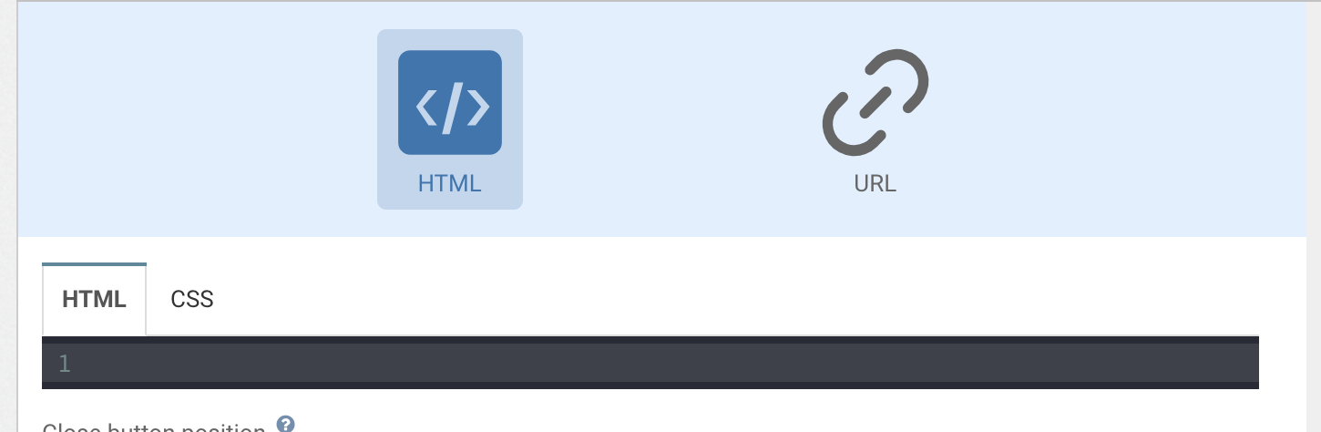
You can also choose an existing URL by choosing the "URL" option at the top of the popup editor. In this case, the code editor is replaced with a "Page URL" field that can contain any URL.
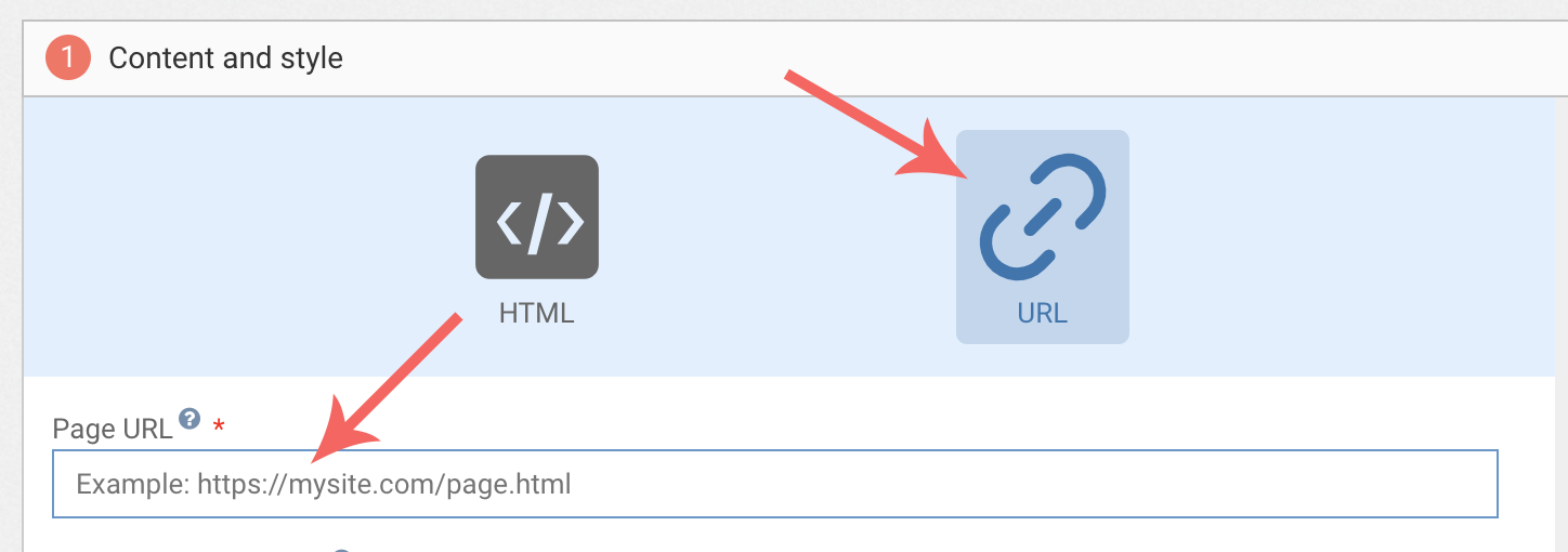
Hosting your popupIf you choose the HTML option, WonderPush will host the popup for you, at no additional charge 😀. If you choose the URL option, the hosting is done somewhere else – depending on the URL you choose.
In this case, you'll have to make sure that the URL in question allows embedding within an
iframe. A web server can prohibit embedding of a URL in aniframeby sending back anx-frame-optionsheader. In this case, the preview in the popup editor will look broken.
Embedding our popup SDK
WonderPush provides a Popup Javascript SDK that you can embed in your popups by adding the following script tag:
<script type="text/javascript" src="https://cdn.by.wonderpush.com/inapp-sdk/1/wonderpush-loader.min.js"></script>All popup built-in templates embed the Popup Javascript SDK.
Embedding the Popup Javascript SDK gives you access to the same functionality available in our Website and Native apps SDKs, like:
- tagging users
- subscribing users to push notifications
- sending events to store user data into WonderPush you can then query, download and use for audience segmentation
- setting and getting installation properties
and more.
There is a complete reference of the Popup Javascript SDK.
Making links
When making a link inside a popup, you have to choose between one of the following behaviors:
- having the link open outside the popup,
- having the link open inside the popup.
Using HTML
This is controlled by the target attribute of your link:
- a link with a
targetattribute will open outside the popup (except iftarget="_self") - a link without a
targetattribute will open inside the popup
<!-- The following will open outside your popup -->
<a href="https://example.com/" target="_blank">Opens outside the popup</a>

<!-- The following will open inside your popup -->
<a href="https://example.com/">Opens inside the popup</a>
When a link opens inside your popup, the contents of the popup is replaced with the contents of the linked page.
When a link opens outside your popup, the user leaves your site or native app to go to the linked page. On websites, that means a navigation will occur and the URL of the address bar will change. On native apps, the default browser application will open the linked page.
Opening a link outside the popup automatically dismisses the popup.
Using Javascript
It is also possible to open links with using the Popup Javascript SDK:
- the
openDeepLinkmethod will try to open the provided URL inside your app when possible, it is ideal for native apps trying to open a deeplink with a custom scheme (such asmyapp://) - the
openExternalUrlmethod will force opening the provided URL in the devices default browser for native apps and in a new window for websites.
Both methods dismiss the popup.
// Tries the URL in the app, defaults to the device browser.
WonderPushPopupSDK.openDeepLink("myapp://example/url");

// Opens the URL in a new window or in the device's default browser
WonderPushPopupSDK.openExternalUrl("https://example.com");
Dismissing the popup
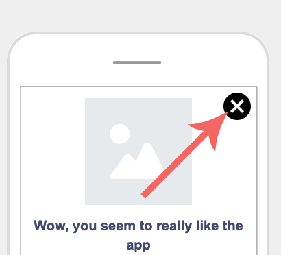
Although the popup's content might not occupy the entire screen, the popup itself does. This means that users have no means of closing the popup besides those you provide.
If your popup does not provide a close button or opens a link, users will have no means to close it
There are 3 ways to dismiss the popup:
- with an external close button by specifying a "Close button position" of "inside", like shown earlier, which will display a close button on top of your popup whatever's inside
- with an HTML tag containing the special
data-wonderpush-dismissattribute
<!-- A close button that looks like a link  -->
<a href="#" data-wonderpush-dismiss>Close</a>

<!-- A close button that looks like a button -->
<button data-wonderpush-dismiss>Close</button>

<!-- Even a div can act as a close button -->
<div data-wonderpush-dismiss>Close</div>- by calling the
dismissmethod of the popup SDK in Javascript
<a href="#" onclick="WonderPushPopupSDK.dismiss();">close</a>Tracking clicks
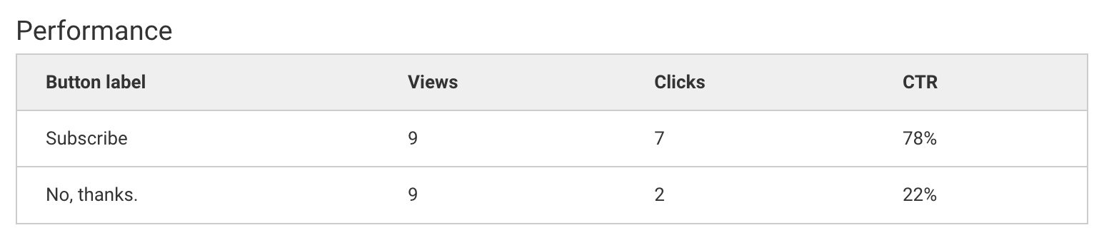
The Popup Javascript SDK provides two simple ways of tracking clicks:
In Javascript, using the trackClick method.
WonderPushPopupSDK.trackClick("Subscribe");Or using the HTML data-wonderpush-button-label="Button label" special data attribute:
<div data-wonderpush-button-label="No, thanks.">No thanks</div>Clicks are reporting in real-time on the detail page of your popup:
Letting users interact with the rest of the screen
When your popup is placed on the side or in a corner, it is often desirable to let users interact with the rest of the screen, like in out Toast template:
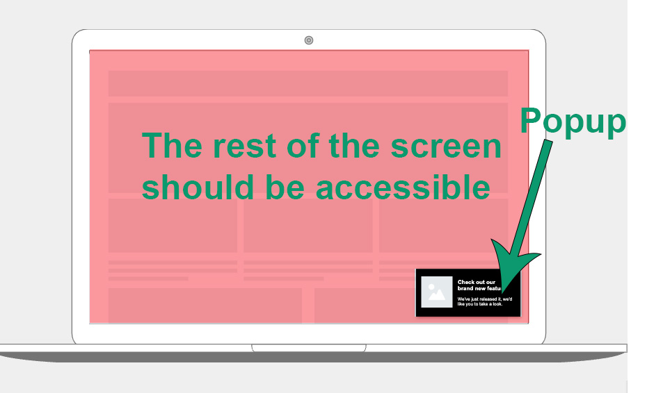
This is achieved by positioning the bodyHTML element of the page using CSS, and setting its background transparent like this:
body {
  position: fixed;
  background-color: transparent;
  width: 300px; /* adapt */
  height: auto; /* adapt */
  right: 10px; /* adapt */
  bottom: 10px; /* adapt */
  padding: 10px; /* adapt */
}
WonderPush will then automatically let users interact with all elements on the page that do not intersect with the position of the body.
Adding images
WonderPush does not provide hosting for popup images at the moment. There are 2 ways to host images for your popups:
- on your own server
- as data URIs directly inside the popup.
Please note that there is a limit of 50kb for the combined HTML and CSS content of your popup.
Converting an image to a data URI is easy, you'll find many converters on the internet.
Data URIs are string in the form data:image/png;base64,iVBORw0KGgoA.... They can be used directly in the src attribute of any img tag like this:
<img src="data:image/png;base64,iVBORw0KGgoA..." />Or as background image in CSS like this:
background-image: url(data:image/png;base64,iVBORw0KGgoA...);
An example showing how to use a data URI in your HTML
Optimizing content presentation
Your popups will be displayed on a variety of different devices with different screen sizes, resolutions and pixel densities. In the sections below we will go through all the steps necessary to making a popup that renders beautifully on all devices.
Viewport
When displaying web content, mobile devices might adopt a desktop viewport, making texts become unreadable.
To avoid this, configure a <meta name="viewport"> in <head>.
The most common viewport configuration to use for popups should:
- Set the content to use the device's native size
- Disable user-controlled zoom
- Display content at 100% scale
This can be achieved using the following:
<meta name="viewport" content="width=device-width, user-scalable=no, initial-scale=1.0">A complete documentation is available on MDN.
Responsive design
Your popup might be displayed on a variety of devices of very different kinds:
- phones
- tablets
- devices in portrait orientation
- devices in landscape orientation
- desktop computers

Use responsive web design techniques (CSS Media queries, Flexboxes, Grids, etc...) to handle this. Firefox, Chrome and Safari all come with tools that allow you to test your content on various form factors.
Light and dark mode
Popups support light and dark modes on all platforms.
Use the prefers-color-scheme CSS media feature to change your style accordingly:
#content {
  background-color: white;
  color: black;
}
@media (prefers-color-scheme: dark) {
  #content {
    background-color: black;
    color: white;
  }
}
Safe area
Modern iPhones and iPads have rounded screen corners, and sometimes a notch (that little black bar where the front cameras are). The screens end up having a non rectangular shape, and content might go under the rounding or the notch itself: users will not be able to see and interact with it.
Apple introduced a concept called "safe area": a rectangular shape where it is guaranteed that 100% of your content will be shown on screen. The default setting for web content is to limit it to the safe area. Borders will be shown around your content, that Batch will fill with your theme's static background color.
Whether your web content will expand into the "unsafe area" (which is the entire screen) is controlled by your <meta name="viewport"> tag.
By using viewport-fit=cover to your viewport, you tell iOS that you're aware of the screen cutouts, and will handle it.
If you do, you will need to add padding on your content using the env() CSS property. More info on MDN. Failing to do so will make some content unreadable to the user.
This can be a tricky concept to understand, so here are some examples:

-
The first screenshot has the following viewport:
<meta name="viewport" content="width=device-width, user-scalable=no, initial-scale=1.0">.
The "unsafe area" has been highlighted in green for exaggeration. Note how web content is automatically put below it. -
The second screenshot has this viewport:
<meta name="viewport" content="width=device-width, user-scalable=no, initial-scale=1.0, viewport-fit=cover">, opting in to drawing in the unsafe area. It failed to take it into account using CSS: content ends up behind the system clock, indicators and notch. -
The third screenshot uses the same viewport as the second, but has the following css rule on its content div:
padding: env(safe-area-inset-top, 0px) env(safe-area-inset-right, 0px) env(safe-area-inset-bottom, 0px) env(safe-area-inset-left, 0px);
The web content expands in the unsafe area and draws its white background, hiding the theme's green color.
Due to layout bugs, prefer using 100vh or any vh related unit when using viewport-fit=cover instead of height: 100%.
Updated about 1 year ago
What’s Next
- Popup SDK reference
- Newsletter popup template
- Survey popup template
- Push subscription popup template
- Push subscription with tags template
- Onboarding carousel popup template
- Contact form popup template
- Reservation form template
- Discount popup template
- Product promotion popup template
- Rating form popup template
- Video popup template