
Discount popup template
Give users a discount code in exchange for their e-mail address
The discount popups is a simple form that collects the user's e-mail address and then displays a discount code.

A discount popup on a desktop computer and a phone
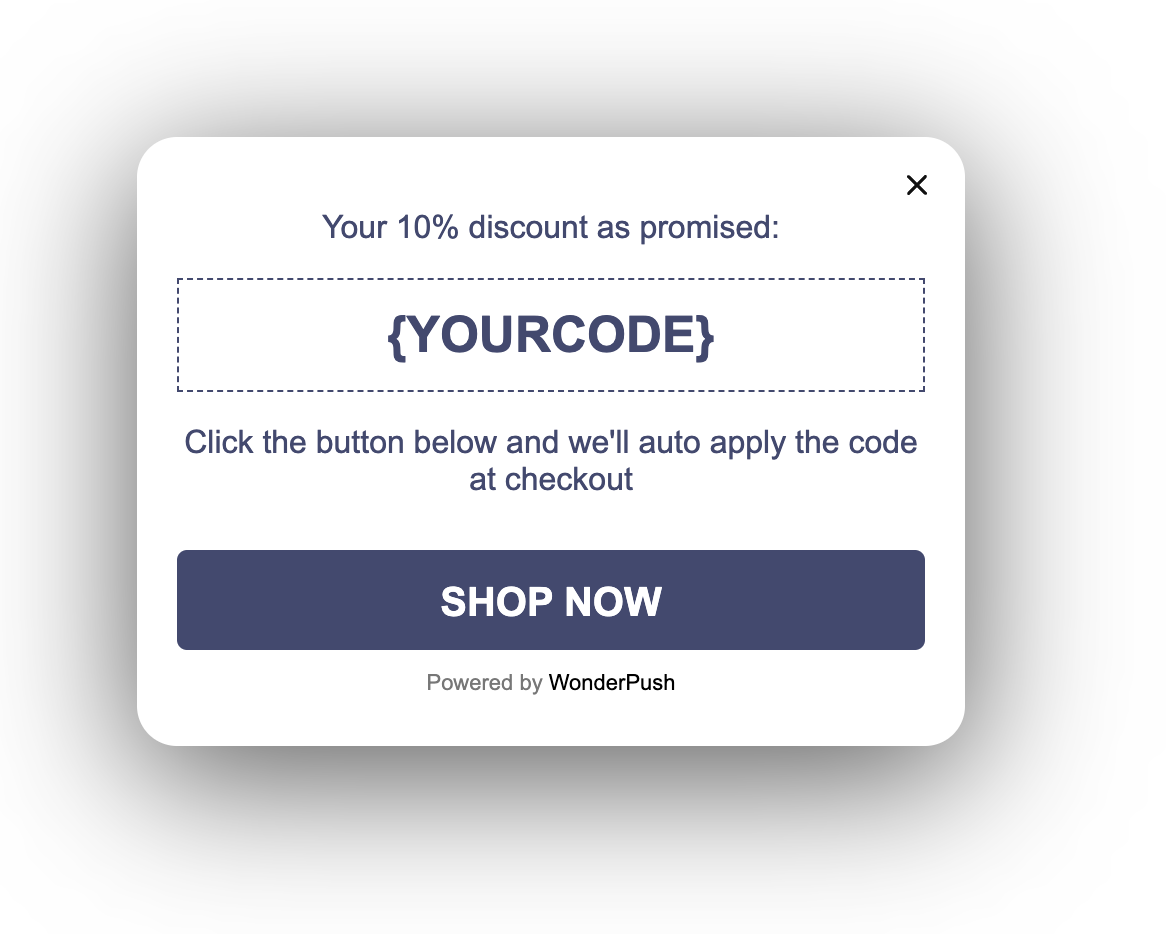
Once the form is submitted, it is replaced with the discount code:
Collected data
This popup collects the visitor's E-mail address.
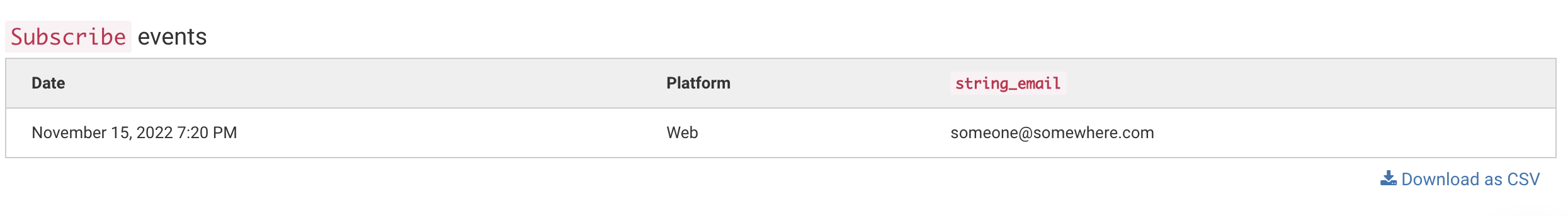
Whenever the form is submitted, an Event is sent to WonderPush. This event is called Subscribe and it contains an attributes named string_email with the visitor's email address.
You can adapt the name of the event and its attributes by changing this line:
window.WonderPushPopupSDK.trackEvent('Subscribe', {string_email: email});You can view and download the collected data on the detail page of your popup:
Audience
By default, the audience is set to Everybody.

But you can limit the audience to users who haven't sent a message yet.
You can further restrict the audience by adding more criteria by clicking "Add criteria". There is a complete reference of the data you can use to segment your audience, there is also a guide to get started with audience segmentation
Trigger
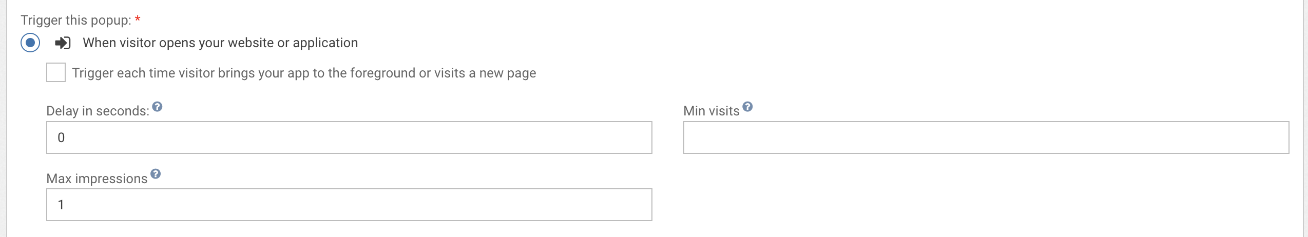
By default, this popup will show only once, when the visitor first opens your website.
Triggering on exit
A common variant of this is to trigger the push subscription popup when users are about to leave, at the end of their first visit, and another time if they visit more than 24h later. That would be done by setting the trigger to "When visitor is about to leave" and keeping the max impressions and time between impressions value unchanged.

You can also exclude some critical pages like login page or checkout page to avoid distracting your user.To do this, use the link "exclude some URLs".
Waiting for a few page views
You can also wait for a number of page views before showing the popup, and show the popup many times at a week interval

Waiting for 3 page views before showing the popup, and show it 5 times at 7 days interval
Adapting the content
This popup is made with HTML. While knowing a little HTML helps, we'll try to take you through the most common changes.
The discount template contains:
- a message, "Congrats, you've unlocked 10% OFF on your first order"
- an e-mail field with a placeholder that reads "Email"
- a button that says "SEND MY DISCOUNT"
- a thank you text that says "Your 10% discount as promised:"
- the actual discount code, which reads
{YOURCODE}by default - a conclusion text "Click the button below and we'll auto apply the code at checkout"
- a "SHOP NOW" dismiss button with a customizable link
Add the actual discount code by changing this line:
<div id="discount">{YOURCODE}</div>Adapt the message by changing this line:
<h1>Congrats, you've unlocked 10% OFF on your first order</h1>Adapt e-mail field's placeholder by changing the placeholder attribute on this line:
<input id="email" type="email" placeholder="Email" required/>Adapt the "SEND MY DISCOUNT" button text by changing this line:
<button class="btn-primary" type="submit" data-wonderpush-button-label="Send my discount">Send my discount</button>Adapt the thank you text by changing this line:
<p>Your 10% discount as promised:</p>Adapt the conclusion by changing this line:
<p>Click the button below and we'll auto apply the code at checkout</p>Adapt the dismiss button by changing:
- the text
- the URL where the user is taken by changing the
hrefattribute from#to a meaningful URL
<a href="#" target="_blank" class="btn-primary">Shop now</a>Look and feel
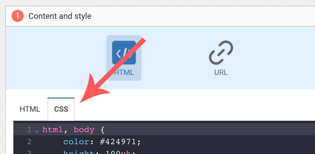
Colors and fonts of texts and buttons can be adapted in the CSS editor:
Adding a background image
Add the following CSS (adapt https://example.com/image.png) to add a background to the main section, making sure the background is stretched to cover the entire section (but keeping its aspect-ratio):
#content {
  background-image: url(https://example.com/image.png) !important;
  background-repeat: no-repeat;
  background-size: cover;
}
Button colors
Add the following CSS.
.btn-primary {
  background-color: blue !important; /* Adapt "blue" to the desired color */
}
Text color
To adapt the colors of the title, input, button and dismiss button, adapt the following.
/* Use the following for the main button */
.btn-primary {
  color: red !important; /* Adapt "red" to the desired color */
}

/* Use the following for the dismiss button */
.btn-text {
  color: red !important; /* Adapt "red" to the desired color */
}

/* Use the following for the title */
h1 {
  color: red !important; /* Adapt "red" to the desired color */
}

/* Use the following for the placeholder input */
input::placeholder {
  color: red !important; /* Adapt "red" to the desired color */
}

/* Use the following for the user content input */
input {
  color: red !important; /* Adapt "red" to the desired color */
}
FAQ
How do I remove the "Powered by WonderPush"
Just remove this line:
<a href="https://www.wonderpush.com/" target="_blank" class="powered-by-wonderpush">Powered by <strong>WonderPush</strong></a>Updated about 1 year ago