
Push subscription with tags template
This popup includes all the functionalities of the Push subscription popup, and it also allows you to add up to 10 categories that your users can choose to subscribe to, so you can send them targeted notifications.
You have full control over the categories presented to the user.
When viewing and clicking the "accept" button through this prompt, all checked categories will be set as Tags you can use in your Segmentation.

The push subscription with tags is the perfect prompt to allow the user to choose the topics about which he wants to be alerted.
Multilingual project?Note that if you have a multilingual audience, you can create variants by language. The correct variant of your popup will be automatically selected based on the detected language of your user.
Collected data
This popup does not collect data other than performance metrics.

The performance report lets you find out how efficient your popup is, and what categories are the most popular.
Audience
By default, the audience is set to exclude users that have already subscribed to push notifications.
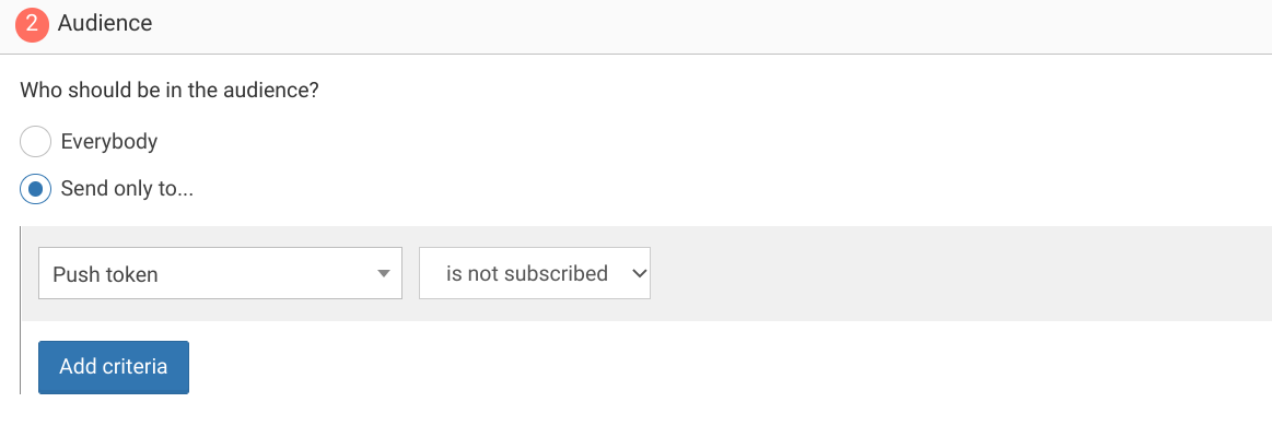
You can further restrict the audience by adding more criteria by clicking "Add criteria". There is a complete reference of the data you can use to segment your audience, there is also a guide to get started with audience segmentation
Trigger
By default, the popup will show immediately when you first visit your website and then twice again at one-day intervals.

You could add a delay of a few seconds to delay the display of this popup or impose a minimum number of visits.
Triggering on exit
A common variant of this is to trigger the push subscription popup when users are about to leave, at the end of their first visit, and another time if they visit more than 24h later. That would be done by setting the trigger to "When visitor is about to leave" and keeping the max impressions and time between impressions value unchanged.

You can also exclude some critical pages like login page or checkout page to avoid distracting your user.To do this, use the link "exclude some URLs".
Waiting for a few page views
You can also wait for a number of page views before showing the popup, and show the popup many times at a week interval

Waiting for 3 page views before showing the popup, and show it 5 times at 7 days interval
Adapting the content
This popup is made with HTML. While knowing a little HTML helps, we'll try to take you through the most common changes.
The push subscription template contains:
- a message, "Receive the latest news, updates and offers as they happen."
- an image
- a list of categories
- a subscribe button, "ALLOW"
- a dismiss button, "No, Thanks"
Adapt the message to make it impactful by changing this line:
<div class="slidedown-body-message">Receive the latest news, updates and offers as they happen.</div>Adapt the image by changing this line and putting the URL of another image in the src attribute:
<img src="https://cdn.by.wonderpush.com/upload/01d48biaffai1lb2/17be02b50c2956b97ce51a3d83eb50e922c90b24/v1/large"/>Adapt the list of categories by adapting this script:
// The list of tags to display, adapt at will
      var tags = [
        // [tag, title]
        ['world_news', 'World News'],
        ['sports', 'Sports'],
        ['finance', 'Finance'],
        // For example:
        ['mytag', 'My Tag'],
      ];
Adapt the Allow button text by changing this line:
<button data-wonderpush-subscribe-to-notifications data-wonderpush-dismiss data-wonderpush-button-label="Allow" class="btn-primary" id="wonderpush-slidedown-allow-button">Allow</button>Adapt the dismiss button text by changing this line:
<button data-wonderpush-dismiss data-wonderpush-button-label="No Thanks" class="btn-text" id="wonderpush-slidedown-cancel-button">No Thanks</button>Look and feel
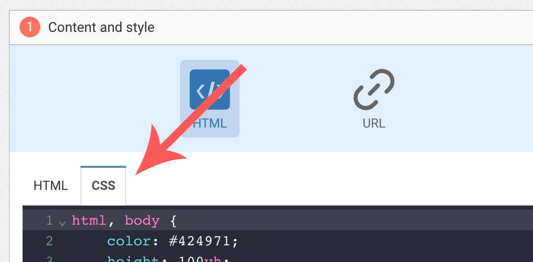
Colors and fonts of texts and buttons can be adapted in the CSS editor:
Adding a background image
Add the following CSS (adapt https://example.com/image.png) to add a background to the main section, making sure the background is stretched to cover the entire section (but keeping its aspect-ratio):
#content {
  background-image: url(https://example.com/image.png) !important;
  background-repeat: no-repeat;
  background-size: cover;
}
Button colors
Add the following CSS.
.btn-primary {
  background-color: blue !important; /* Adapt "blue" to the desired color */
}
Text color
To adapt the colors of the title, input, button and dismiss button, adapt the following.
/* Use the following for the main button */
.btn-primary {
  color: red !important; /* Adapt "red" to the desired color */
}

/* Use the following for the dismiss button */
.btn-text {
  color: red !important; /* Adapt "red" to the desired color */
}

/* Use the following for the title */
h1 {
  color: red !important; /* Adapt "red" to the desired color */
}

/* Use the following for the placeholder input */
input::placeholder {
  color: red !important; /* Adapt "red" to the desired color */
}

/* Use the following for the user content input */
input {
  color: red !important; /* Adapt "red" to the desired color */
}
FAQ
How do I remove the "Powered by WonderPush"
Just remove this line:
<a href="https://www.wonderpush.com/" target="_blank" class="powered-by-wonderpush">Powered by <strong>WonderPush</strong></a>Updated about 1 year ago