
Using the dashboard
The overview page of your dashboard provides detailed analytics of your project.
Metrics
Your project's dashboard Overview page exposes key metrics of your project:
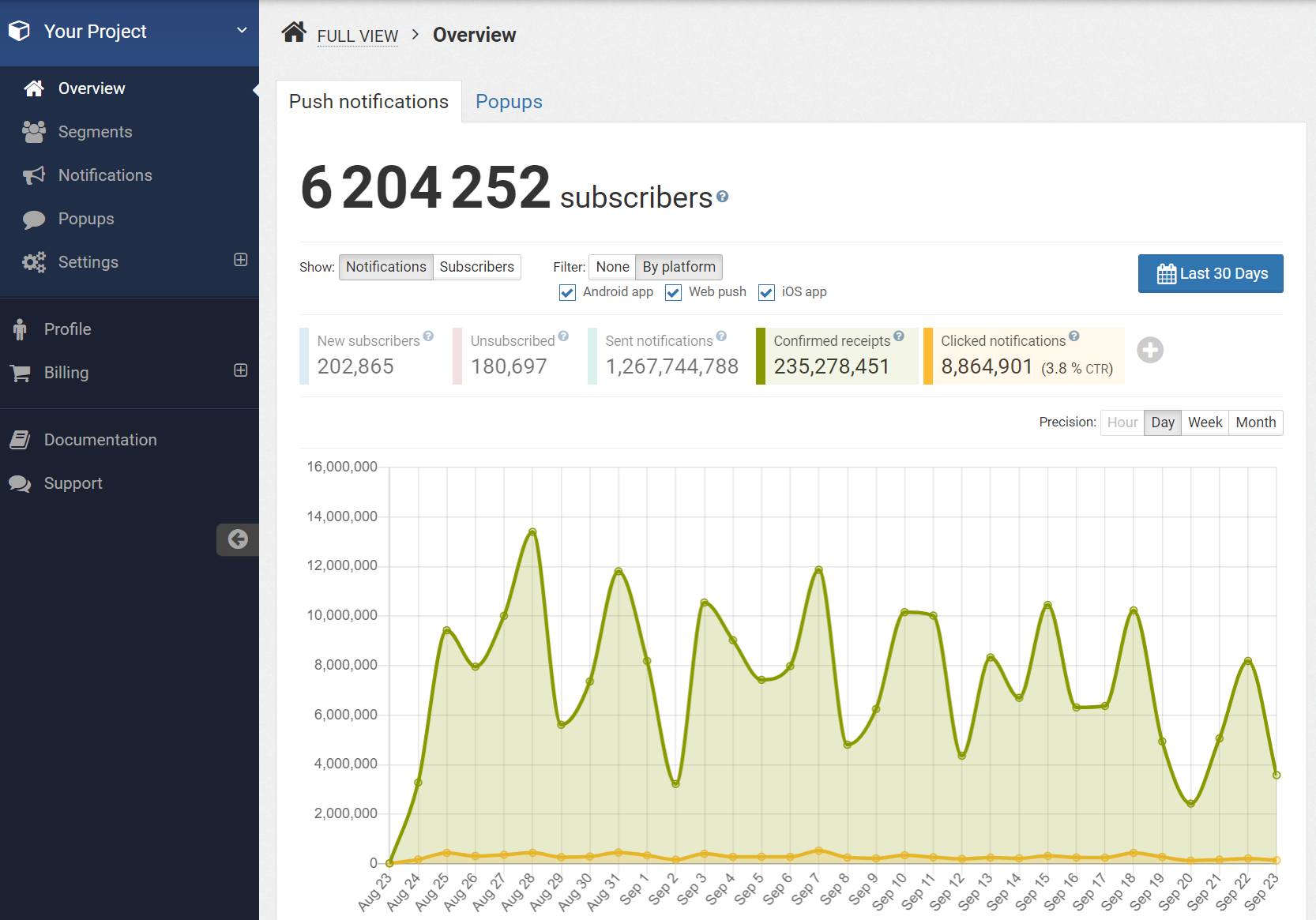
Notifications versus Subscribers
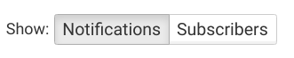
There are two sets of metrics on the Overview page:
- metrics related to notifications,
- metrics related to unique subscribers.
You can switch from one set to the other using this selector:
With notifications metrics, you get detailed reports on the volume of notifications sent, confirmed, clicked, etc.
With subscribers metrics, you get corresponding reports deduplicated by user.
Metric reference
| Metric | Description | Metric | Description |
|---|---|---|---|
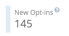
| New opt-ins | number of users that subscribed to push notifications. | ||
| Unsubscribed | number of users who opted-out of push notifications | ||
| Total visits | Number of visits. | Unique visitors | Number of unique visitors. |
| Notifications sent | Number of notifications sent. | Notified users | Number of users that received a notification. |
| Confirmed receipts | Number of notifications acknowledged by the targeted devices. | Confirmed recipients | Number of devices that acknowledged a least one notification. |
| Notifications clicked | Number of notifications clicked. | Clicking users | Number of users that clicked on a notification. |
| Popup views | Number of popups impressions. | Popup viewers | Number of users that saw a popup. |
| Popup clicks | Number of popups clicks | Popup clickers | Number of users that clicked a popup. |
Choosing what metrics to show
Clicking on a metric name toggles its visibility in the graph. This setting is saved in your browser.
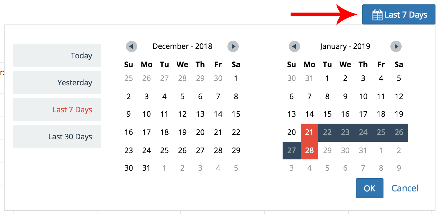
Choosing a date range
You can change the date range of your reports by clicking on the date range button and using the date range selector:
Choosing a precision
You can get reports detailed by hour, day, week and month. To change the precision, click on the precision selector:
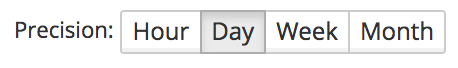
The precision affects the number of points drawn on the graph, as well as the number of rows on the table below the graph. For example, if you've chosen a day precision, you will get one point on the graph and one row in the table per day. If you've chosen week precision, you will get one point on the graph and one row in the table per week.
Please note that depending on the date range you've set, all precisions might not be available. This avoids plotting too many points on the graph.
Filtering by platform
If your app uses multiple platforms, you can choose which platform to show on the Overview page by using the Filter selector and selecting the platform(s) of your choice:
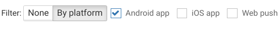
Please note that if your app doesn't use multiple platforms that selector will not be shown.
Adding your own metrics
If you are sending your own events, you can use them to set up your own metrics on the Overview page. You can add your own metrics by clicking on the “Plus” icon next to the Clicked notifications metric:

Then fill in the metric form by choosing a Label and an Event:
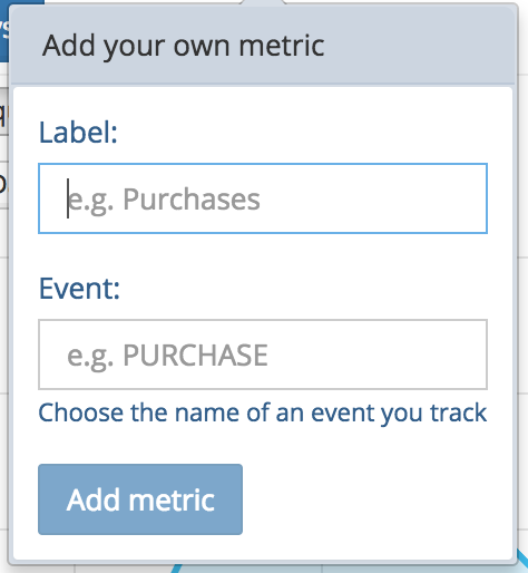
Your metrics are saved in your browser so you don't have to set them up every time you visit the Overview page.

If you need to monitor opt-out users directly on the Overview page, fill @OPT__OUT:invalidated in the metric form as shown here.
Updated about 1 year ago