
Onboarding carousel popup template
This carousel template is an example foronboarding a mobile application or a website during which the user will be invited to subscribe to push notifications and then to share their location. It is composed of three swipeable screens that can be easily customized to match other use cases.

An onboarding carousel that lets you subscribe to push and ask for geolocation permission
Collected data
This popup does not collect user data other than performance metrics.
Audience
By default, the audience is set to Everybody.

But you could also target on of your segments, for example the segment "New Users"
You can further restrict the audience by adding more criteria by clicking "Add criteria". There is a complete reference of the data you can use to segment your audience, there is also a guide to get started with audience segmentation
Trigger
By default, the popup will show only once, right away upon the first visit of your website.

Triggering the popup immediately on first visit, and only once.
Triggering on exit
A common variant of this is to trigger a carousel when users are about to leave, at the end of their first visit, and another time if they visit more than 24h later. That would be done by setting the trigger to "When visitor is about to leave" and keeping the max impressions and time between impressions value unchanged.

Triggering the popup when users are about to leave (Exit intent)
Waiting for a few page views
You can also wait for a number of page views before showing the popup, and show the popup many times at a week interval

Waiting for 3 page views before showing the popup, and show it 5 times at 7 days interval
Content
The carousel template contains three slides.
The first slide has:
- a title, "Stay up to date"
- a message, "Get our latest news and offers"
- an image
- a positive button, "Allow notifications"
- a dismiss button, "Later"
Here's where to find them in the code to change them:

The second slide has:
- a title, "Let us find the closest"
- a message, "Your location data will stay private"
- an image
- a positive button, "Allow location"
- a dismiss button, "Later"
Here's where to find them in the code to change them:

The third slide has:
- a title, "Thank you!"
- a message, "We hope you'll have a great time with us"
- an image
- a dismiss button, "Get started"
Here's where to find them in the code to change them:

Look and feel
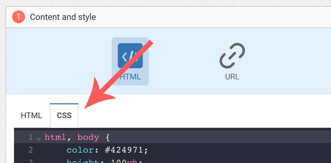
Colors and fonts of texts and buttons can be adapted in the CSS editor:
Adding a background image
Add the following CSS (adapt https://example.com/image.png) to add a background to the main section, making sure the background is stretched to cover the entire section (but keeping its aspect-ratio):
#content {
  background-image: url(https://example.com/image.png) !important;
  background-repeat: no-repeat;
  background-size: cover;
}
Adding a specific background image to each screen
Add the following CSS (adapt https://example.com/image1.png) to add a background to the slide-1 element, making sure the background is stretched to cover the entire section (but keeping its aspect-ratio):
#slide-1 {
  background-image: url(https://example.com/image1.png) !important;
  background-repeat: no-repeat;
  background-size: cover;
}
And repeat it for slide-2 and slide-3
Button colors
Add the following CSS.
.btn-primary {
  background-color: blue !important; /* Adapt "blue" to the desired color */
}
Adding specific button colors to each screen
Add the following CSS.
#slide-1 .btn-primary {
  background-color: red !important; /* Adapt "red" to the desired color */
}
And repeat it for slide-2 and slide-3
Text color
To adapt the colors of the title, input, button and dismiss button, adapt the following.
/* Use the following for the main button */
.btn-primary {
  color: red !important; /* Adapt "red" to the desired color */
}

/* Use the following for the dismiss button */
.btn-text {
  color: red !important; /* Adapt "red" to the desired color */
}

/* Use the following for the title */
h1 {
  color: red !important; /* Adapt "red" to the desired color */
}

/* Use the following for the placeholder input */
input::placeholder {
  color: red !important; /* Adapt "red" to the desired color */
}

/* Use the following for the user content input */
input {
  color: red !important; /* Adapt "red" to the desired color */
}
Adding specific text colors to each screen
Simply add the prefix referring to the chosen slide like this:
/* Use the following for the title of the slide 1 */
#slide-1 h1 {
  color: red !important; /* Adapt "red" to the desired color */
}

/* Use the following for the button of the slide 1 */

#slide-1 .btn-text {
  color: red !important; /* Adapt "red" to the desired color */
}

/* decline for the other elements you want to modify for each slide */
FAQ
How do I remove the "Powered by WonderPush"
Just remove this line:
<a href="https://www.wonderpush.com/" target="_blank" class="powered-by-wonderpush">Powered by <strong>WonderPush</strong></a>Updated about 1 year ago