
Customize the display of popups
You have complete control over the way poups are displayed
Getting started with in-app messaging is easyRead our guides for websites and mobile apps
In this guide you'll learn about:
- colors,
- placement options,
- buttons,
- entry & exit animations.
We'll also see how developers can handle the display themselves, or customize it with CSS (only for websites).
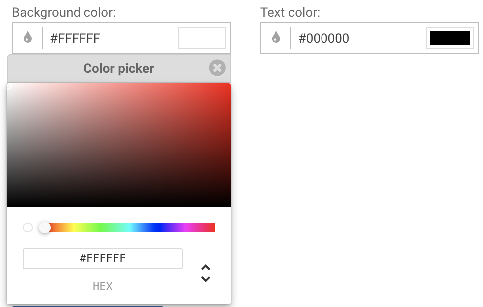
Background & text colors
Most in-app formats (card, modal and banner) let you choose background and text color using a full-featured color picker.
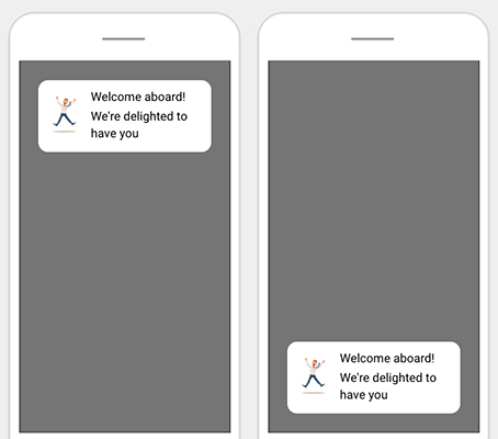
Placement
Most in-app formats adapt themselves to their host device and decide alone of their size and position.
The banner format allows you to choose a position, Top or Bottom:
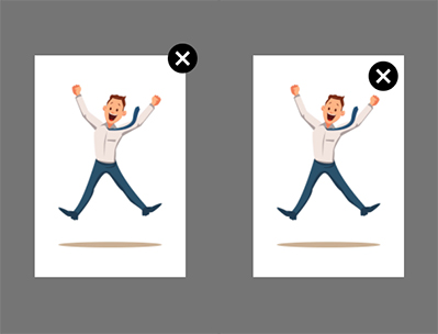
The image-only and feature a close button, which can be set inside, or outside the box:
Buttons
Buttons are available in the modal format (which has one) or the card format (up to two). Buttons have a text, an optional background color and a text color.
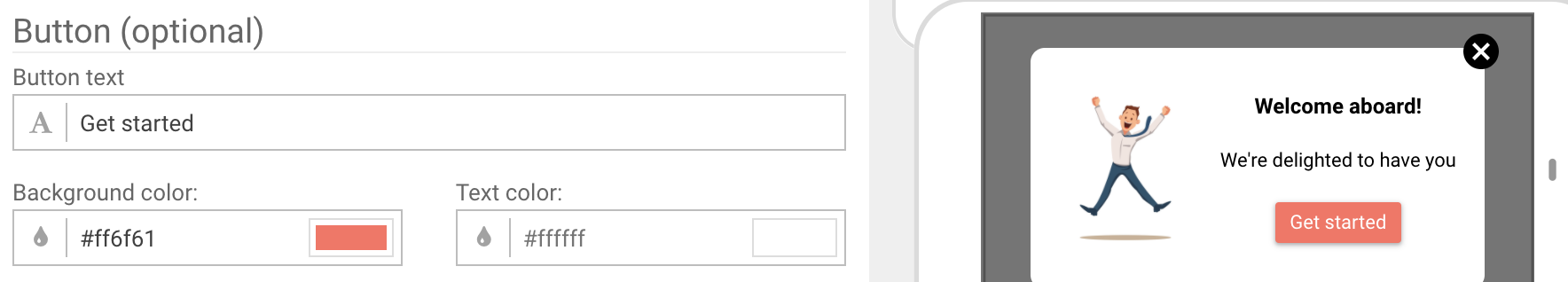
It's possible to attach links and actions to buttons as detailed in this guide. When no action or link is attached to a button, the button simply dismisses the in-app.
Clicks on buttons that simply dismiss the in-app are not counted in the in-app clicks of your dashboard metrics.
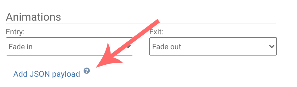
Animations
All in-app formats have an animated entry and exit. Most of them (except the banner format) let you choose which entry and exit animation to use.
Here is a quick showcase of the different animations available:
Entry animations are:
- Fade in: the in-app goes smoothly from transparent to fully visible
- Slide-in from right, left, top or bottom: the in-app enters the screen from the specified side and smoothly travels to its final position in the center
Exit animations are:
- Fade out: the in-app goes smoothly from transparent to fully visible
- Slide-out right, left, up or down: the in-app leaves the screen by smoothly traveling to the specified direction.
You are now ready to compose beautiful in-app messages!
Handling the display of in-app messages from code
Customizing in-apps with CSS
This technique is only available to websites. All in-apps displayed by WonderPush use CSS classes and IDs you can safely refer to in your own CSS files.
In particular, the main container always has the ID wpiam-message. You can use your browser's inspector to find the classes and IDs of elements of interest to you and customize them by referencing them in your own CSS.
Handling the display of in-apps yourself
For websites and mobile apps that wish to handle the display of in-apps themselves, we've created an API that lets you do exactly that.
You can display data coming from our dashboard, along with your own data, coming from a CMS for instance.
You have all the freedom to display anything, like a YouTube video or any other type of content.
You still benefit from the delivery mechanism and logic of in-apps (the audience, triggers and capping are unaffected), but your code is responsible for:
- handling the display of in-apps,
- reporting the display of in-apps,
- reporting in-app clicks.
Step 1: creating the Message Display Component
The Message Display Component is an optional object you can provide to our iOS, Android and Website SDKs to handle the display of in-app messages yourself.
This means that you have to implement an interface / protocol in the programming language for your platform, and provide this implementation to our SDK.
Implementing a Message Display Component is done like this:
var messageDisplayComponent = function(inApp, reportingCallback) {
     // Display in-app message
     // Report in-app viewed
     // Report any in-app clicks
  	return true; // false if you want WonderPush to handle the display
};
class MessageDisplayComponent implements InAppMessagingDisplay {
@Override
public boolean displayMessage(@NonNull InAppMessage inAppMessage, @NonNull InAppMessagingDisplayCallbacks callbacks, long delay) {
// Display in-app message
// Report in-app viewed
// Report any in-app clicks
return true; // false if you want WonderPush to handle the display
}
}import WonderPush
class MessagingDisplayComponent: NSObject, InAppMessagingDisplay {
func displayMessage(_ messageForDisplay: InAppMessagingDisplayMessage, displayDelegate: InAppMessagingDisplayDelegate) -> Bool {
// Display in-app message
// Report in-app viewed
// Report any in-app clicks
return true; // false if you want WonderPush to handle the display
}
}// In MessageDisplayComponent.h
#import <WonderPush/WonderPush.h>
@interface MessageDisplayComponent <WPInAppMessagingDisplay>
@end
// In MessageDisplayComponent.m
@implementation MessageDisplayComponent
- (BOOL)displayMessage:(WPInAppMessagingDisplayMessage *)messageForDisplay displayDelegate:(id<WPInAppMessagingDisplayDelegate>)displayDelegate {
// Display in-app message
// Report in-app viewed
// Report any in-app clicks
return YES; // NO if you want WonderPush to handle the display
}
@endStep 2: setting the message display component
To handle the display yourself, your must pass your message display component to WonderPush like this:
WonderPush.setInAppMessagingDisplayCallback(messageDisplayComponent);// In your Application.java or Activity.java
import com.wonderpush.sdk.inappmessaging.InAppMessaging;
// ...
InAppMessaging.getInstance().setMessageDisplayComponent(new MessageDisplayComponent());// In AppDelegate.swift
import WonderPush.InAppMessaging
class AppDelegate : NSObject, UIApplicationDelegate {
func application(_ application: UIApplication, willFinishLaunchingWithOptions launchOptions: [UIApplication.LaunchOptionsKey : Any]? = nil) -> Bool {
// Other WonderPush initialization code
// …
InAppMessaging.inAppMessaging().messageDisplayComponent = MessageDisplayComponent()
}
}// In AppDelegate.m
#import <WonderPush/WonderPush.h>
// …
- (BOOL)application:(UIApplication *)application willFinishLaunchingWithOptions:(NSDictionary<UIApplicationLaunchOptionsKey,id> *)launchOptions {
// Other WonderPush initialization code
// …
WPInAppMessaging.inAppMessaging.messageDisplayComponent = [MessageDisplayComponent new];
}Step 3: implementing the message display component
When your message display component gets called, it's time for you to display the in-app. This is typically done within the unique context of your application or website and is not detailed here.
The message display component gets called along with 2 arguments:
- the in-app object, which contains the texts, colors and images input in the dashboard,
- a reporting callback.
When implementing the message display component, please make sure that you call the reporting callback's:
logImpressionmethod when the in-app has successfully been displayed,logClickmethod when a button gets clicked,logDismisswhen the in-app was simply dismissed.
Also, you have the choice to return false from your message display component if you do not want to handle this particular in-app's display.
// Call when the in-app is successfully displayed:
reportingCallback.logImpression(inApp);

// Call when reporting a click.
// Pass the `actions` array of the in-app. For example inApp.content.card.primaryActions
// Pass the DOM `event` associated with the click
reportingCallback.logClick(inApp, actions, event)

// Call when in-app dismissed
reportingCallback.logDismiss(inApp);
// Call when the in-app is successfully displayed:
callbacks.impressionDetected();
// Call when reporting a click.
// Pass the `actions` array of the in-app. For example inApp.content.card.primaryActions
// Pass the DOM `event` associated with the click
callbacks.messageClicked(actions)
// Call when in-app dismissed
callbacks.messageDismissed(InAppMessagingDismissType.CLICK);// Call when the in-app is successfully displayed:
displayDelegate.impressionDetected(for:messageForDisplay);
// Call when reporting a click.
// Pass the `action` of the in-app. For example inApp.primaryAction
displayDelegate.messageClicked(messageForDisplay, with:messageForDisplay.primaryAction);
// Call when in-app dismissed
displayDelegate.messageDismissed(messageForDisplay, dismissType:WPInAppMessagingDismissTypeUserTapClose);// Call when the in-app is successfully displayed:
[displayDelegate impressionDetectedForMessage:messageForDisplay];
// Call when reporting a click.
// Pass the `action` of the in-app. For example inApp.primaryAction
[displayDelegate messageClicked:messageForDisplay withAction:messageForDisplay.primaryAction];
// Call when in-app dismissed
[displayDelegate messageDismissed:messageForDisplay dismissType:WPInAppMessagingDismissTypeUserTapClose];Step 4: passing along custom data (optional)
WonderPush lets you pass data directly from the dashboard's in-app composition form to your code in the form of a JSON payload.
This payload can be filled by pressing the Add JSON payload button:
And providing valid JSON in the text-area that subsequently appears:
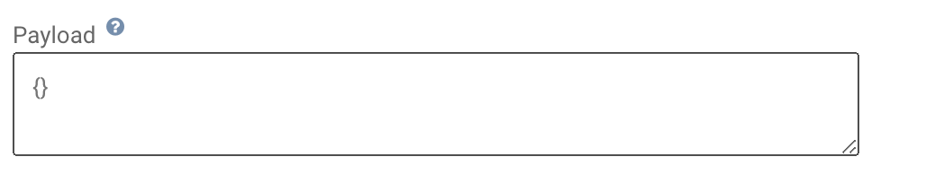
This JSON payload is then available directly under the payload property of the in-app object passed to your message display component.
Congratulations, you have now fully customized the display of your in-apps.
Updated about 1 year ago